 What am I doing? What is it for?
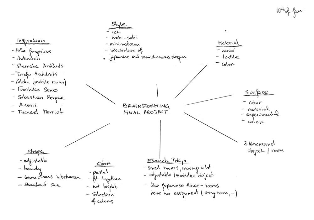
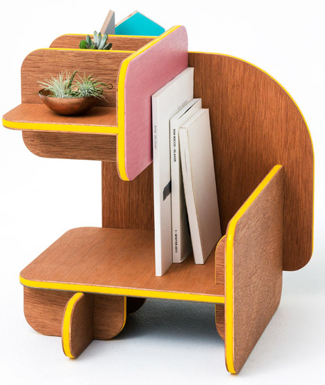
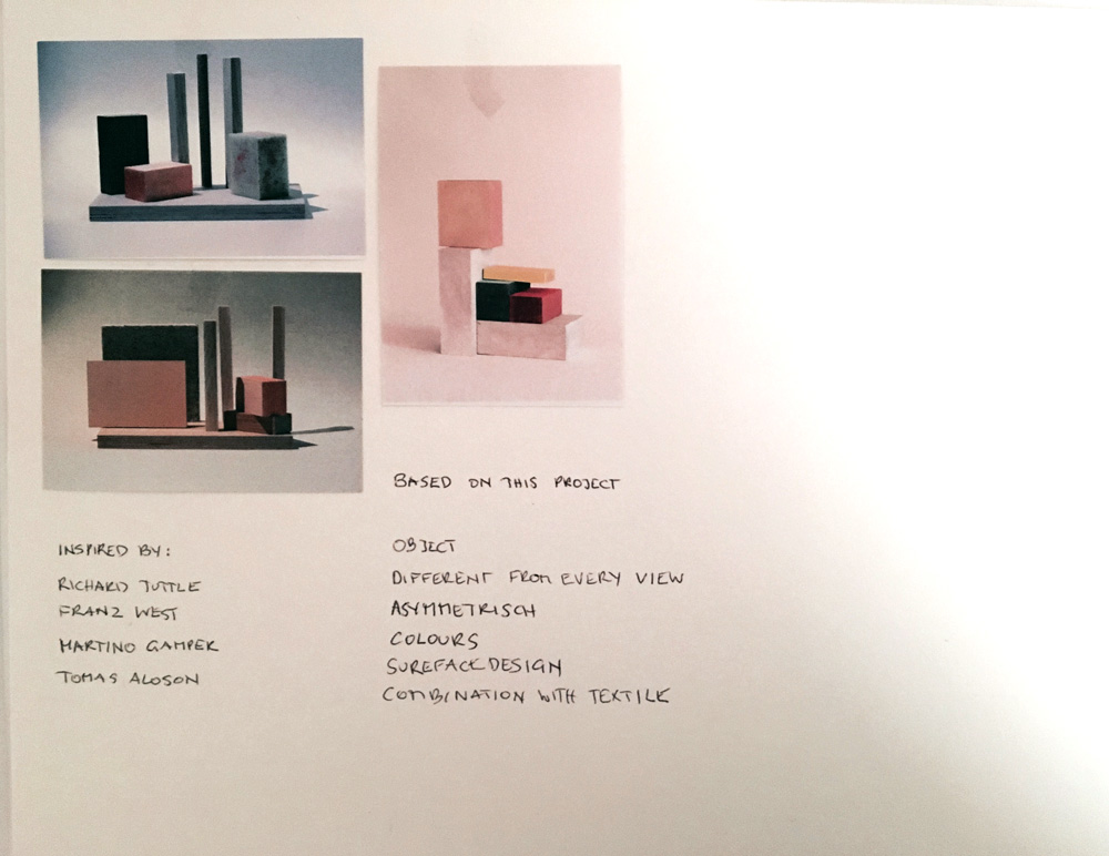
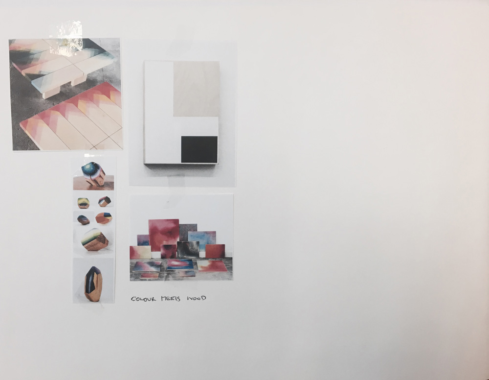
My vision of my final master’s project is something three-dimensional between art and design, made out of wood, with an attractive surface and a sense of colour.
Within our own personal environments, we arrange the objects in different ways. Every person, every flat and every day is unique. The objects I´m designing are furniture, which fit in every room in different ways. This furniture should make life easier for people who move a lot.
Following my research in Tokyo in November 2016 I became really interested in the way Japanese people live especially in central Tokyo where the flats are very tiny and it´s not possible to own as much stuff as when you are living in a big house. Sometimes they don´t even own a table, because of the lack of space.
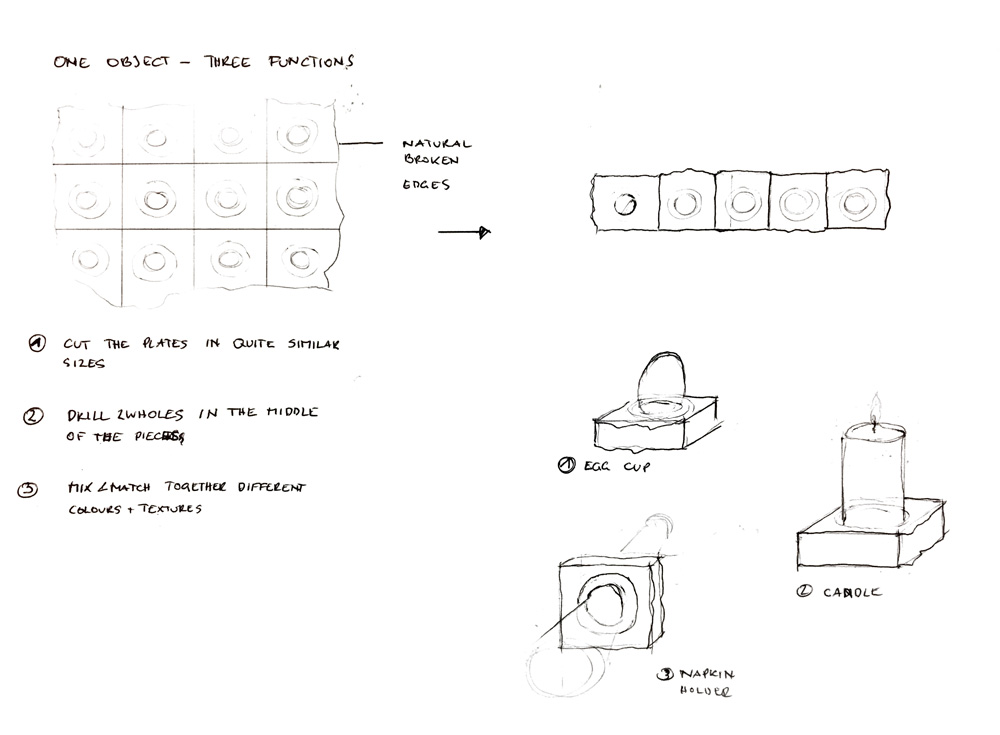
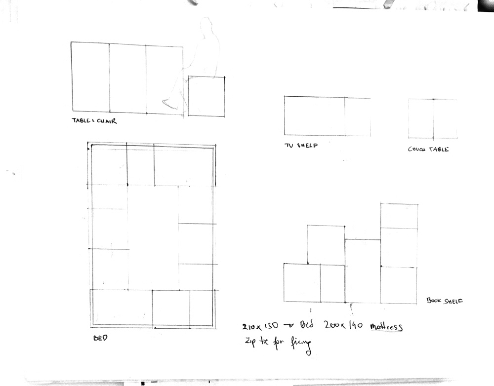
This has led me to believe that the function of the object should be multifunctional, without a special assignment. Based on the idea of a traditional Japanese House, the rooms originally had no special fixed purpose. Every room was covered with tatami mats. The people who live there used one room for many different purposes. I want my products to work in the same way. They are not designed for a special use. You can use them as a coffee table, a bookshelf, a stool, a table or even as a bed.
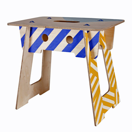
One example of this belief in practice is the Van Bo Le-Mentzel designed the “Berliner stool“ for the Maxim Gorki Theatre as a scenery. In 2011 it became low-budget furniture for everybody. €10 - 10 minutes - 10 screws. The stool can also be used as part of a shelf or coffee table. Therefore you just have to return the object.
http://hartzivmoebel.blogspot.co.uk/p/berliner-hocker.html
Another interesting multifunctional furniture is the “Ulmer Stool“ (1954) by Max Bill who designed it for the students of the University in Ulmer. It can be used as a stool, a tray, as part of a shelf, a coffee table,…
Or the Authentic Wood by Le Corbusier at Cassina, 1950
https://www.dezeen.com/2011/01/22/authentic-wood-by-le-corbusier-at-cassina/
What does it look like?
Surface
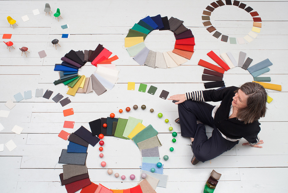
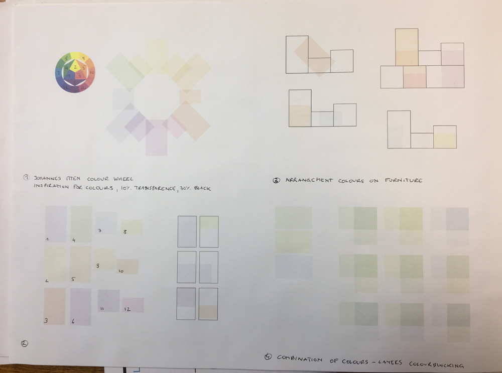
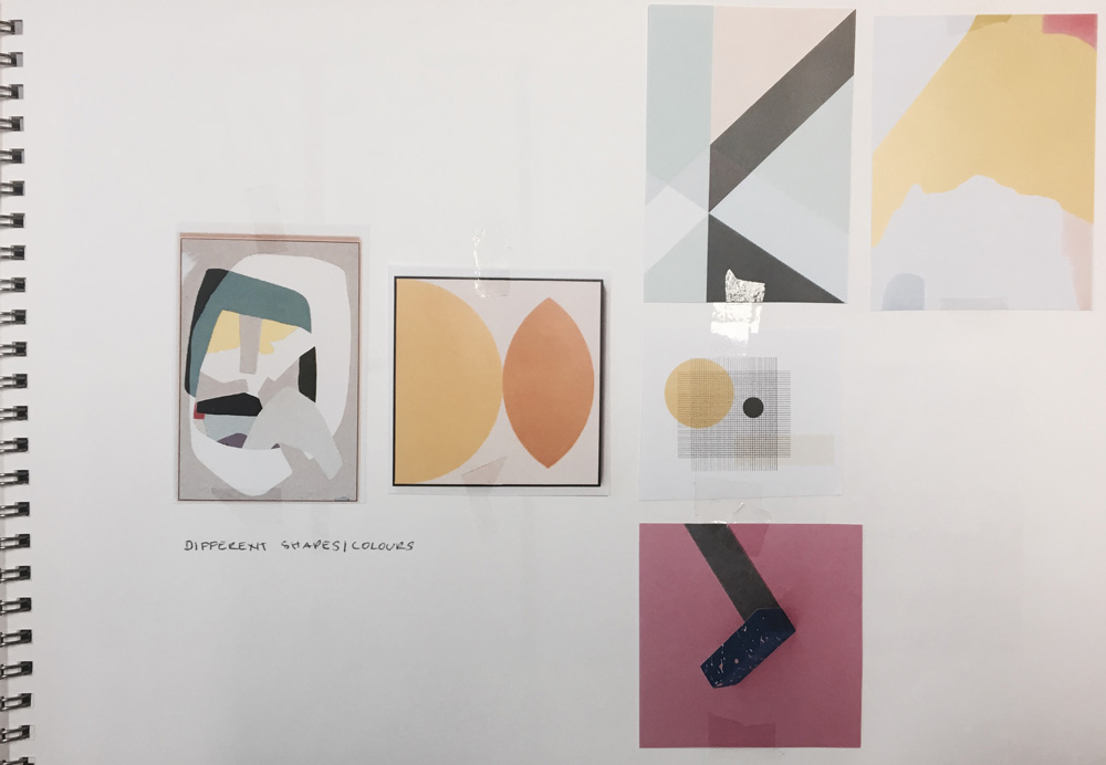
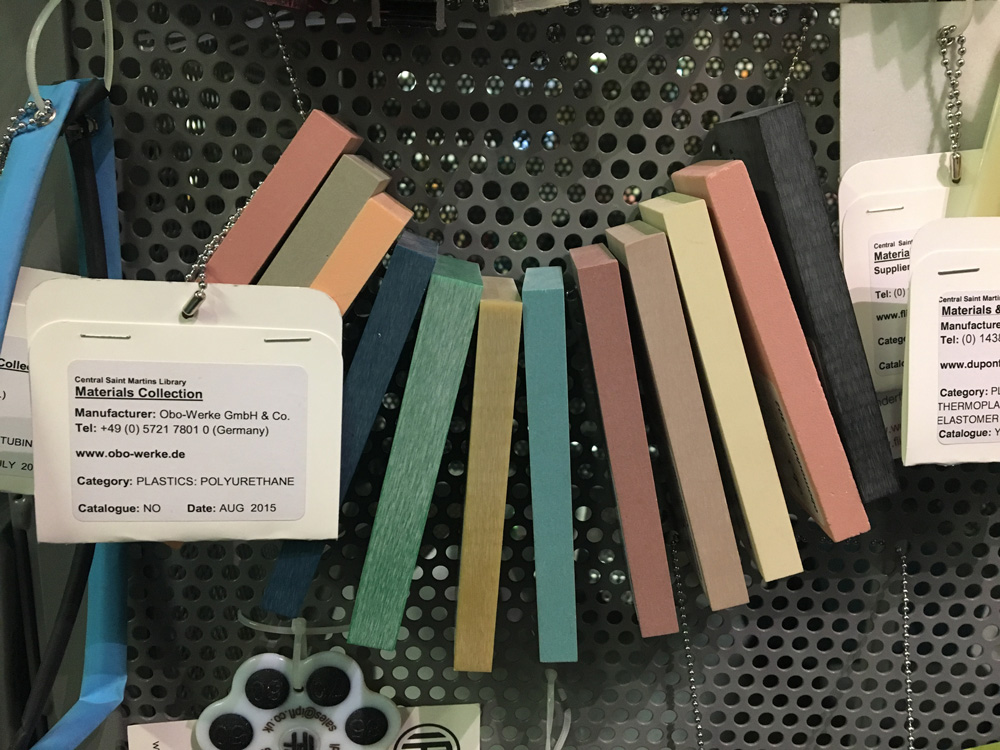
“Colours and surfaces are crucial when it comes to the effect of a product. They influence ones first impressions and have a lasting effect in terms of the product’s emotional aura.“ Hella Jongerius, 2011
Hella Jongerius is a Dutch industrial designer. Her work is about collections of textile, furniture and tableware with a special focus on colours.
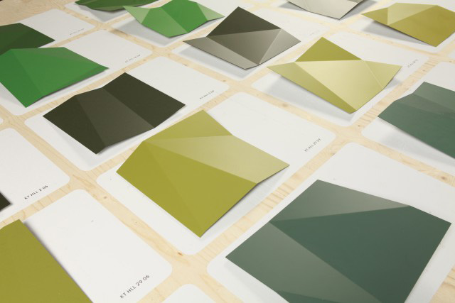
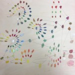
Colour Lab
The Colour Lab is about research for a new color range for virta products.
http://www.jongeriuslab.com/work/colour-lab
Colour Wheel
http://www.metropolismag.com/April-2016/The-Dutch-Designer-Behind-Vitras-Color-Revolution/
Colour in changing daylight
http://www.jongeriuslab.com/work/colour-in-changing-daylight
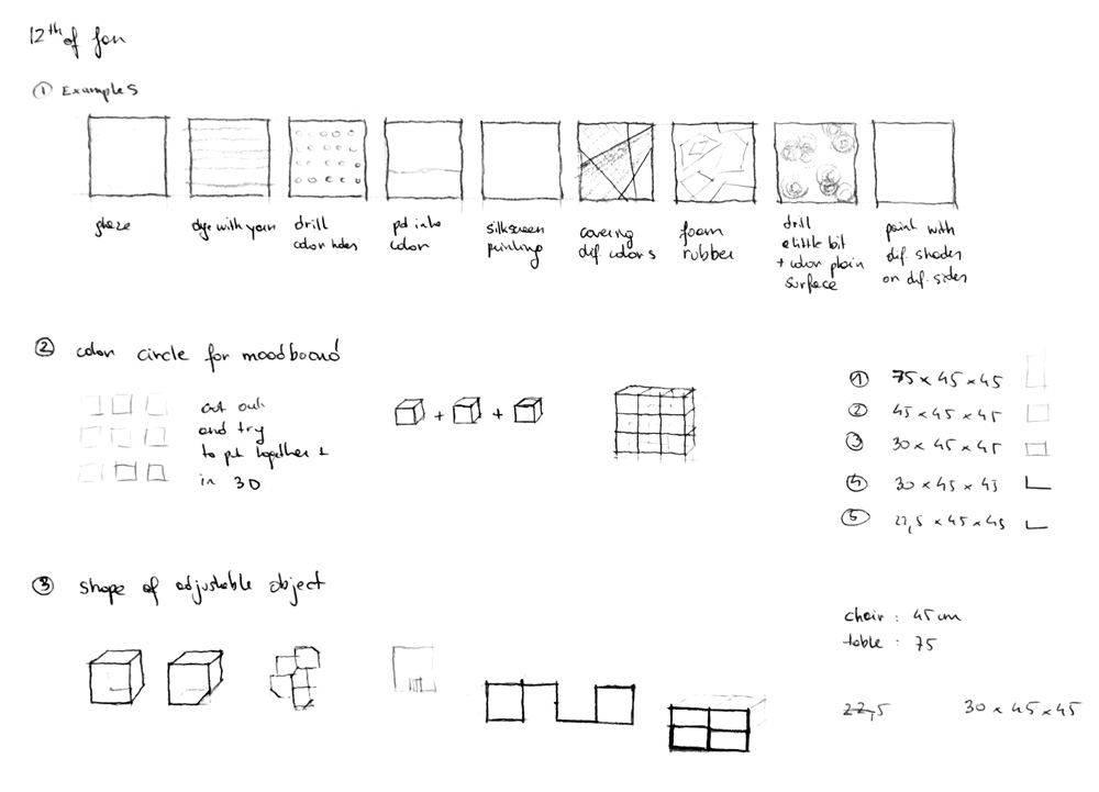
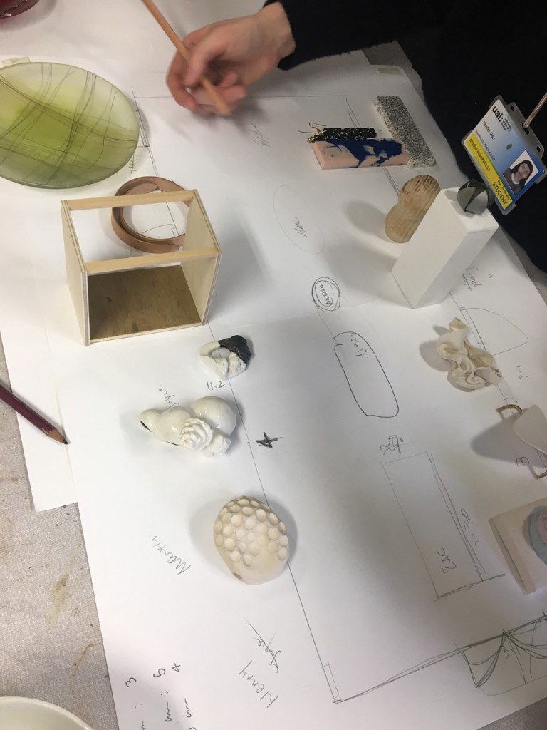
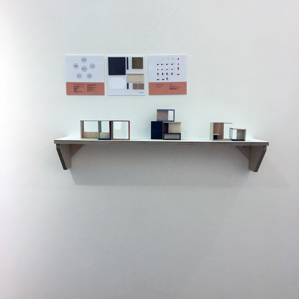
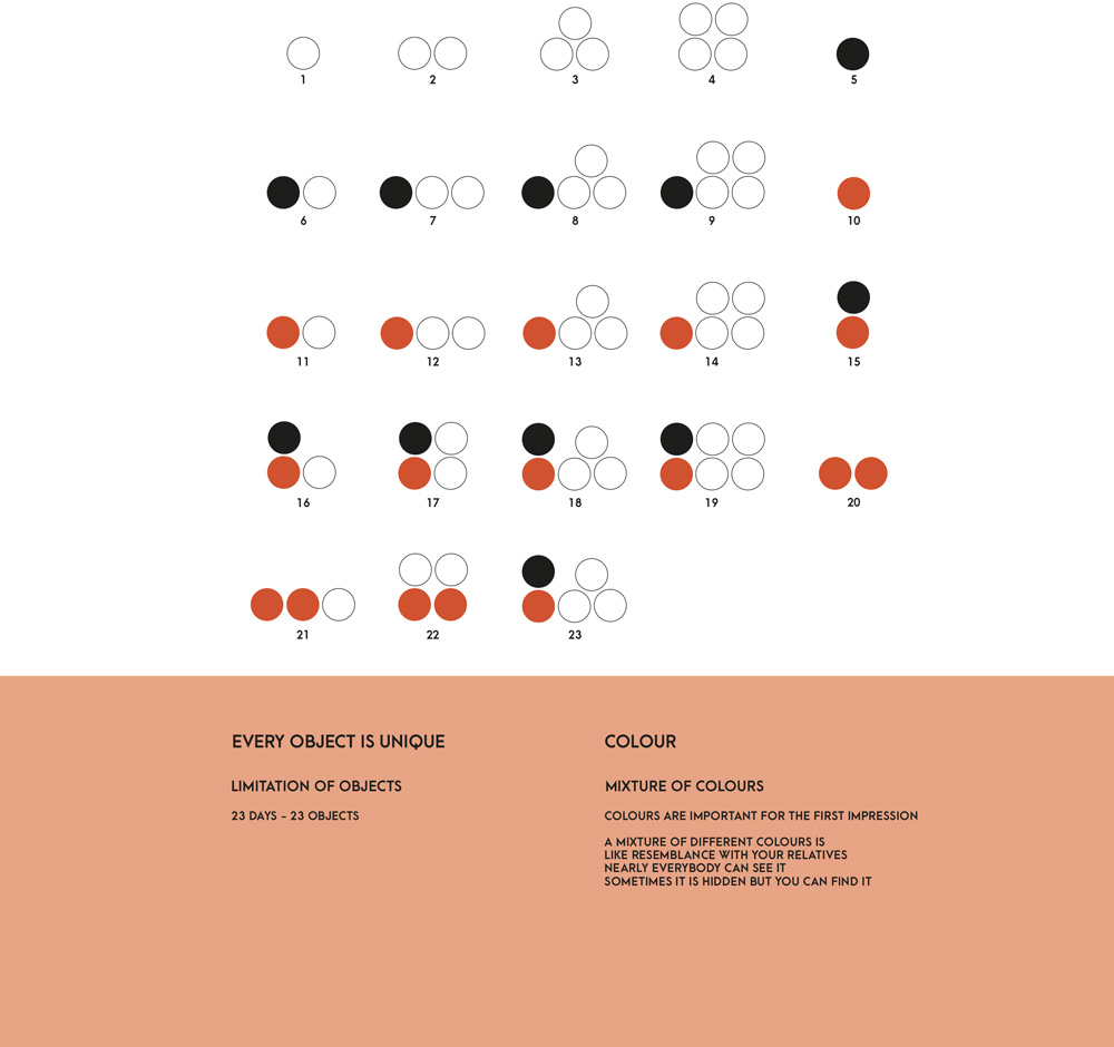
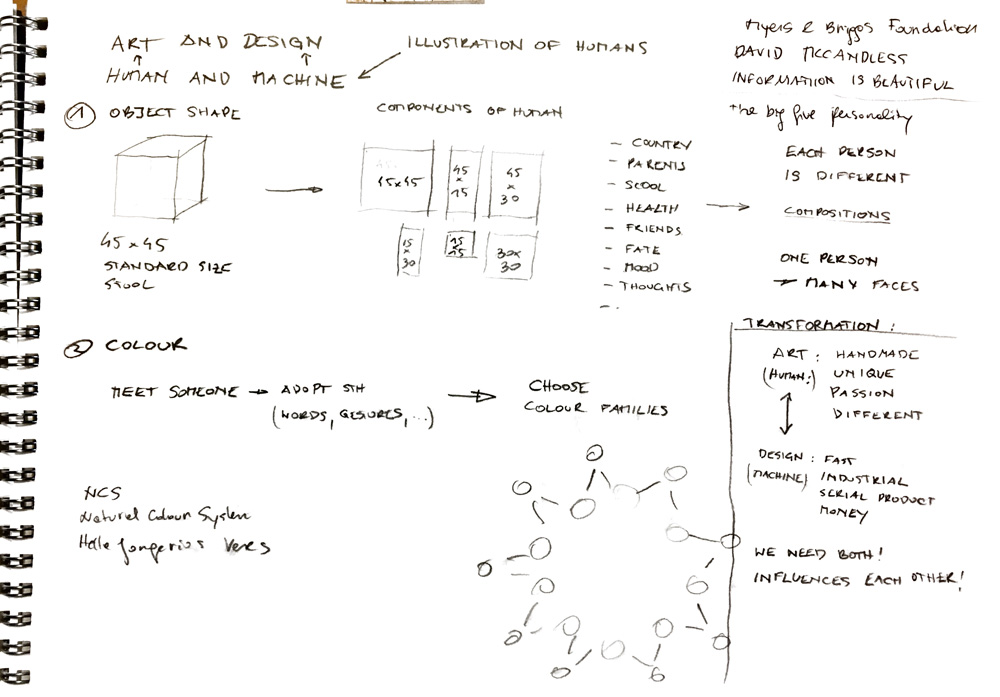
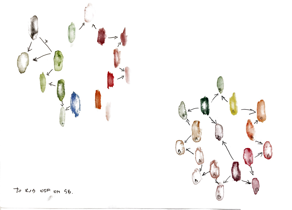
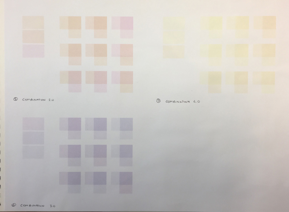
As Hella Jongerius said, the sense of colour is very important for an object. My aim is to figure out a color palette where every colour complements each other. The user can decide then decide which colours he or she likes most and build up sculptures like kids used to do that with building blocks. As the objects are coloured the person doesn´t have to paint the walls of their flat, which is most annoying when you are moving a lot.
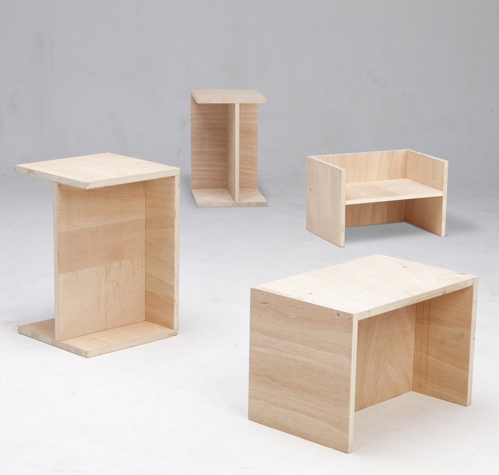
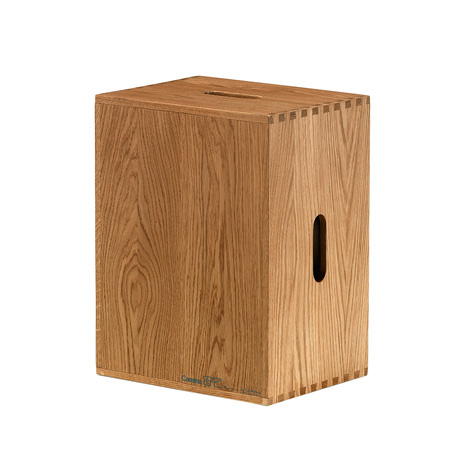
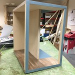
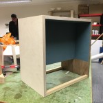
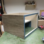
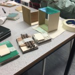
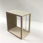
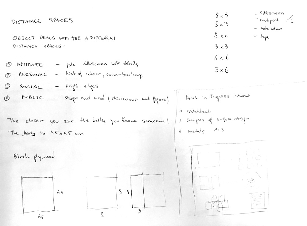
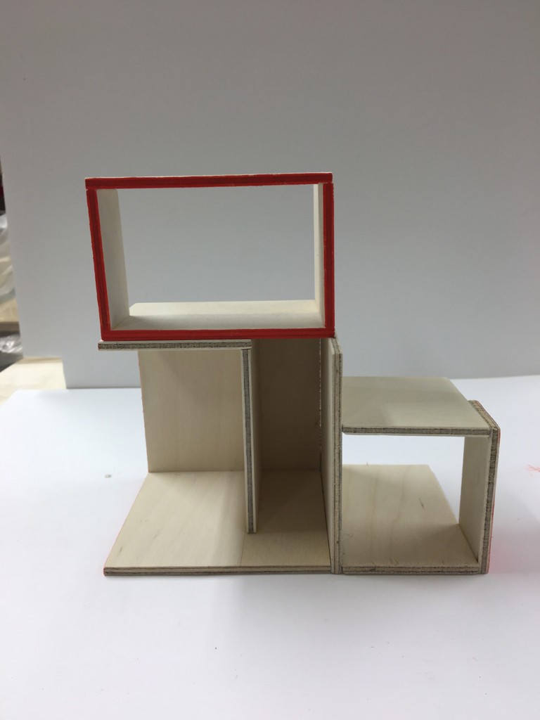
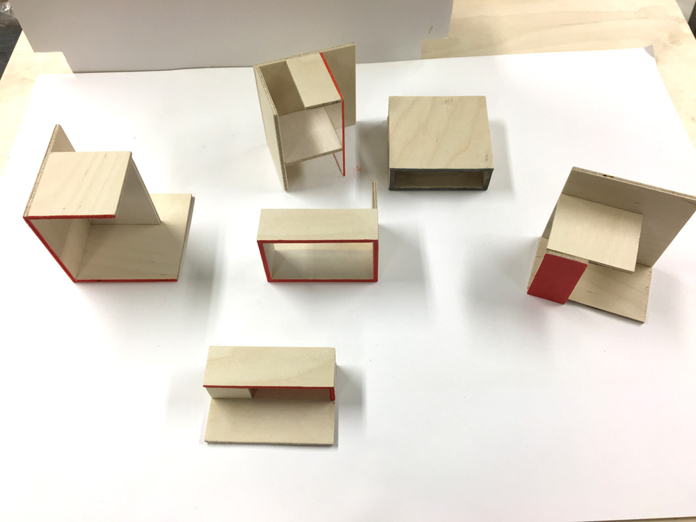
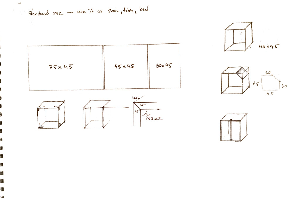
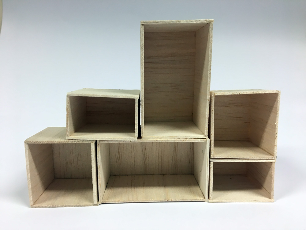
To pile the objects up into a shape they need to be cuboid. The size of the object is standard that it could be used as a stool, a table, a bed,..
These objects are an intersection between Japanese aesthetic and Scandinavian design.
What do I mean with Japanese aesthetic?
I admire the minimalism of Japanese Design. In comparison to the western minimalism, they often choose natural materials, which makes the room in my opinion more livable.
In the book „ Wabi-sabi für Künstler, Architekten und Designer.“ edited by Dietz Matthias, Japanese aesthetic is based on clearness and repetition. The design medium is material poverty and the refuse of lush decorations. Cause of that there is more space for mental wealth. (s. Dietz 2011, S. 76)
Dietz Matthias (2011): Wabi-sabi für Künstler, Architekten und Designer. Aus dem Englischen von Leoard Koren, Tübigen: Wasmuth
…and Scandinavian Design?
Beauty and function where independent, timeless furnitures were meant to be used and affordable for majority. A main characteristic of Scandinavian Design are the soft curves, simplicity and the use of natural materials. (s. Gura, p.14)
(Sourcebook of Scandinavian Furniture. Designs for the 21st century, Judith Gura, 2007: W.W. Norton & Company, London)
So in my opinion, scandinavian design and traditional japanese design have lots in common. The two main aspects of my product should be the simplicity and the natural material.
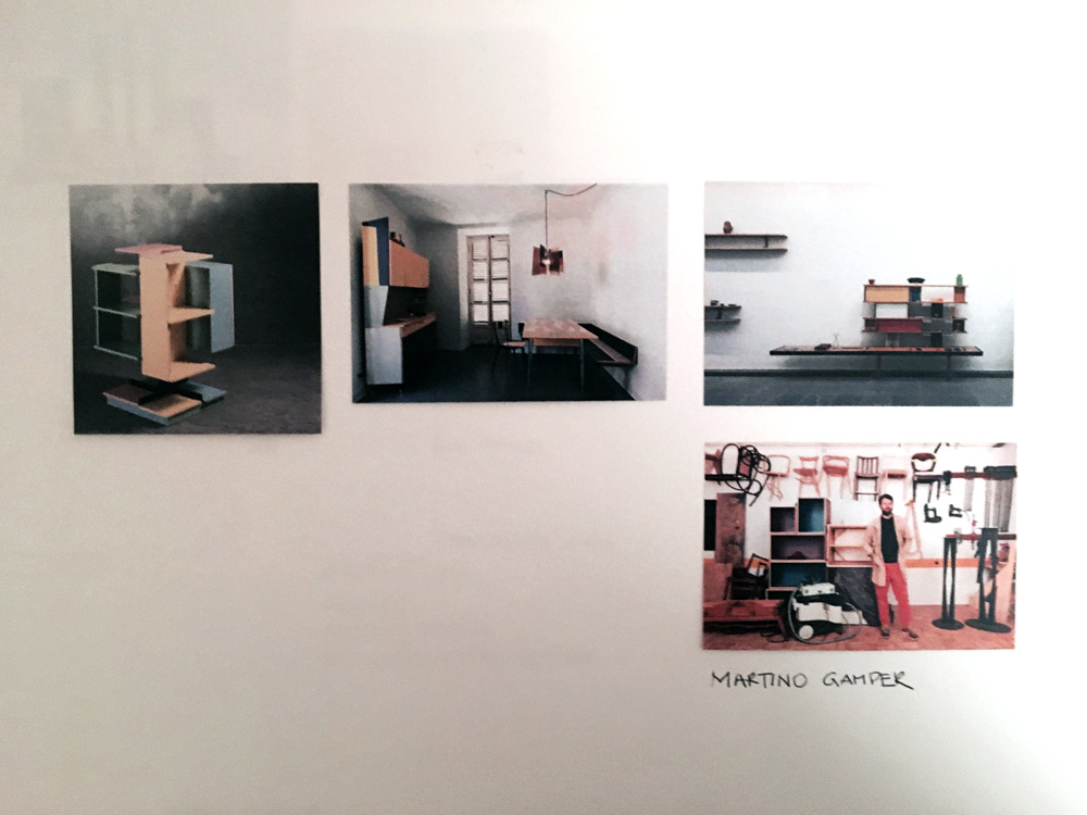
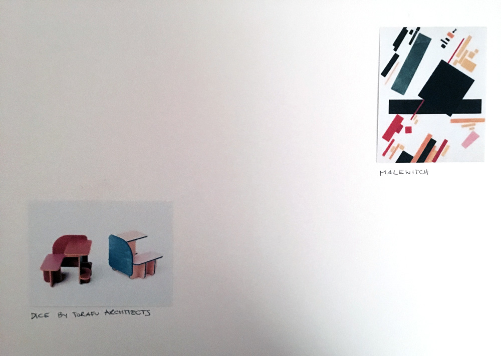
Dice by Torafu Architects
This is a six-sided piece of furniture by Japanese studio Torafu Architects which can be flipped over for different functions.
"We designed a piece of furniture with multiple resting positions that can be used by young children up until they reach adulthood by rolling it over like a dice," said the designers.
"By avoiding the constraints imposed by single-purpose furniture, we created a multi-purpose piece of furniture that can be used as a companion evolving with us through life so that we can continue using with nostalgia our childhood furniture even after we become adults," said Torafu Architects.
https://www.dezeen.com/2014/08/12/torafu-architects-multi-functional-dice-furniture-adults-children/
http://torafu.com/works/dice
Torafu Architects based in Tokyo are one of my favourite architects. They direct their attention to colour, shape and material in all of their projects, no matter if it is a building or a product.
 04
04
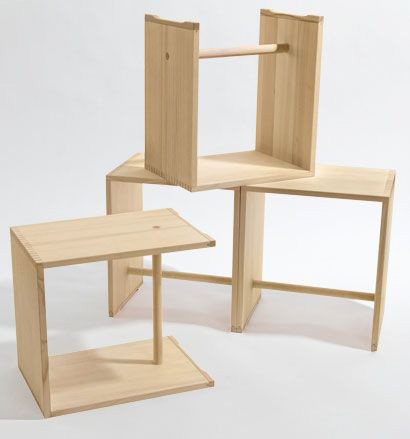
 Here is a short video of the arrangement of the objects:
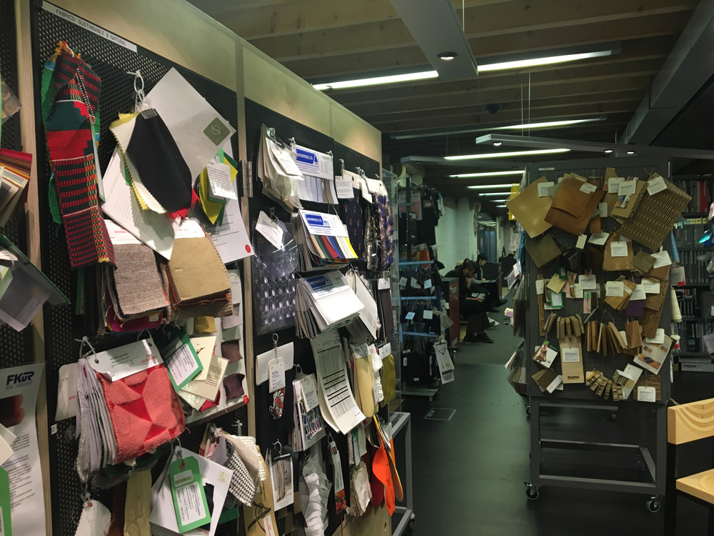
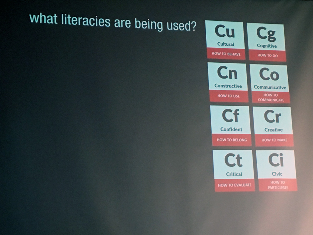 What is literacy?
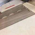
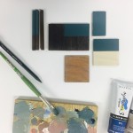
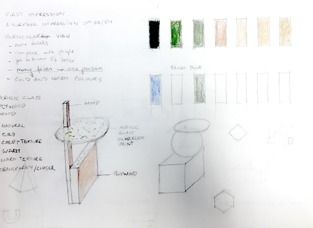
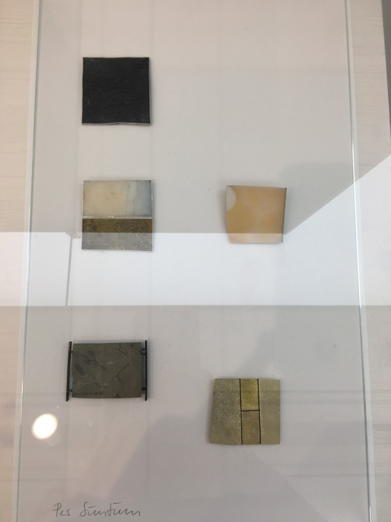
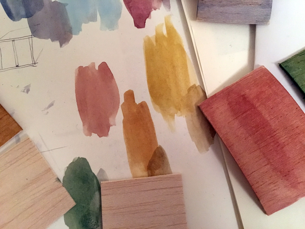
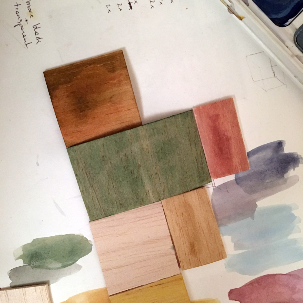
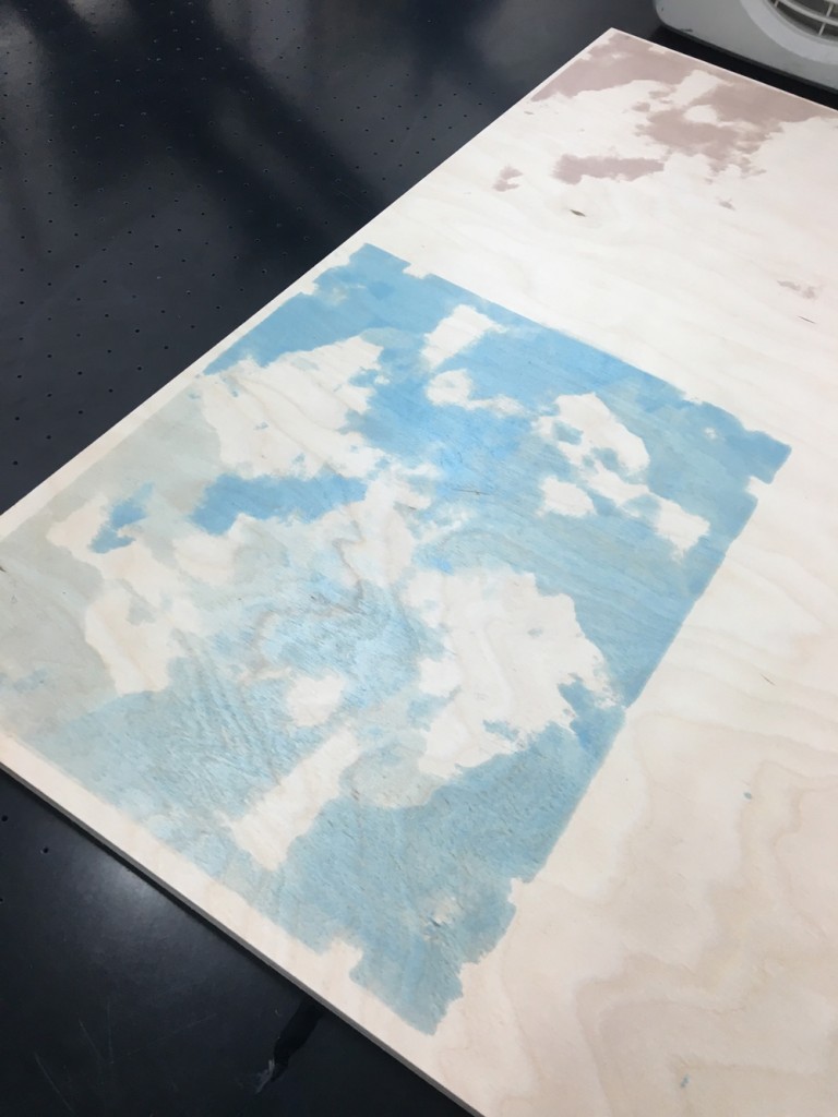
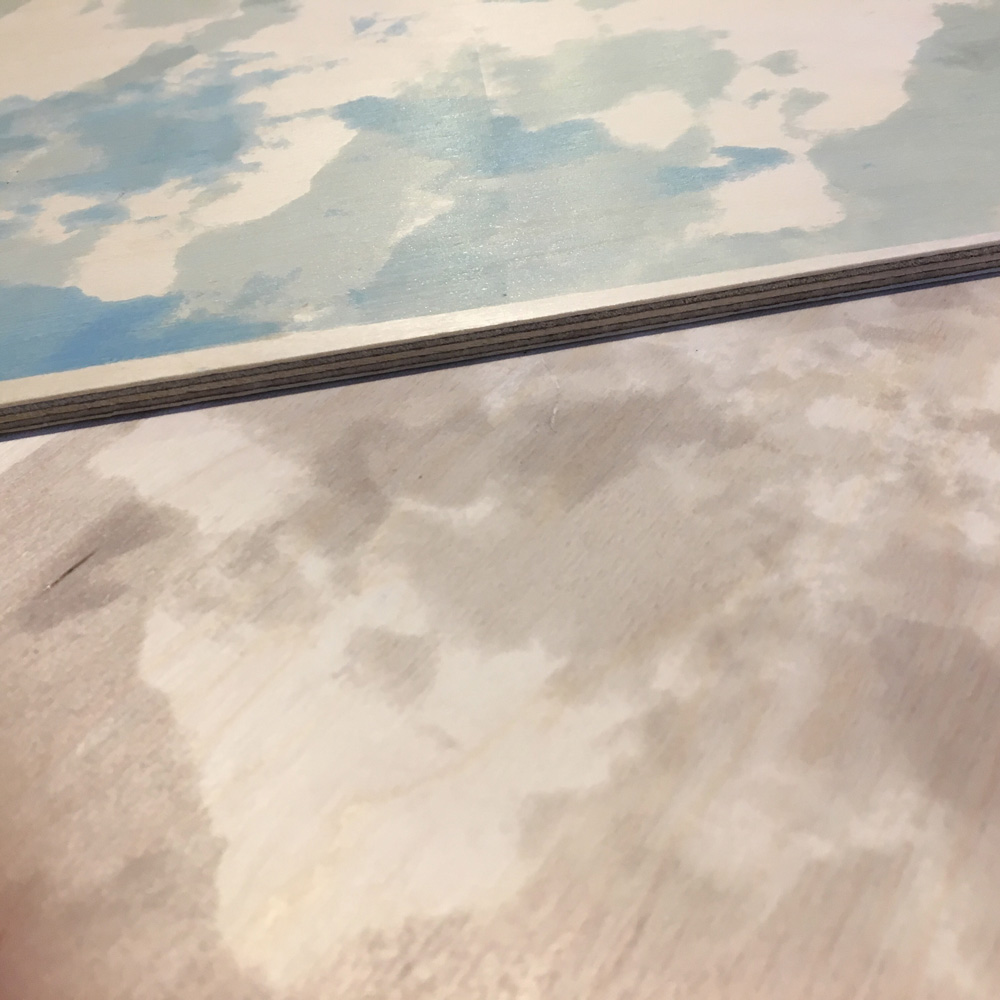
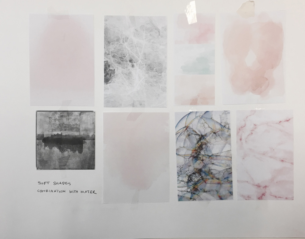
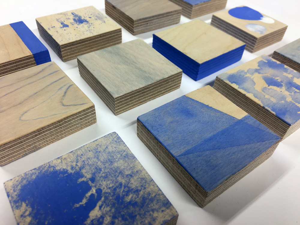 I tried different ways of colouring the surface of wood. Therefore I used one colour and different amounts of water.